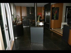
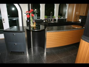
The interior photos are courtesy of Elizabeth FitzZaland from Green City Builders in Vancouver. Many thanks to Sam FitzZaland and Owen Crane from Green City Builders for the exceptional work on this project!


Client and Agenda
The client, a watercolour artist of Dutch descent, saw photos of our contemporary Landsend Project in a magazine, and asked us to assist her in the renovation of the kitchen, dining area and powder room in her Kitsilano home.
She was looking for a contemporary design, a calm and uplifting environment with casual seating for 2 people. Due to the radiant heat in the existing floor we tried to avoid more than necessary disruption of the concrete slab in regards to changes to plumbing or electrical work.

Creating a space concept
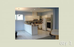
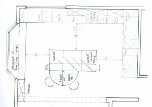
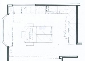
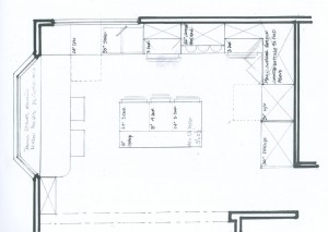
The existing footprint divided the space into a small U-shaped kitchen and a small nook with a bay window.

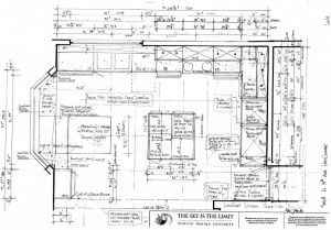
We created variations around the theme of an L-shaped perimeter, with an extension of lower cabinetry along the bay window wall, seating for 2, and an island. The shorter leg of the ‘L’ was the perfect location for the tall cabinetry, the window area along the long wall was perfect to be the clean up area, and the remainder of that outside wall was destined to be the right location for the stove and hoodfan, as this made venting the hood one easy task.


Although this seemed to be a rather straightforward concept it took us a while to settle on the right solution for the informal seating and the island design.
As is typical for our approach here at THE SKY IS THE LIMIT we played with a number of different approaches ( 6, to be precise), and ended up with a 7th final version.

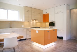
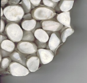
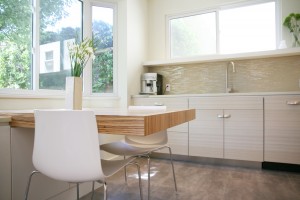
This final version sports a floating rectangular countertop that shoots out from the bay window, and a corresponding 4′x4′ island, which sits on metal furniture legs on a ‘sea’ of white pebbles submerged in resin.
Selection of finishes
Working with artists is always very rewarding. The way they express themselves in their artwork already gives a lot of clues about their preferences in terms of hues, texture and composition.
Claudia’s atmosperic naturalistic watercolours exude a sense of energetic calm, and seeing them I knew we would be looking at a combination of tone on tone materials and a mix of soft textures.
The energy of the space itself seemed to ask for light colours, but in the midst of my mix of materials that I brought on site in order to play with them together with the client, both of us felt the need for an energizing element. Playing upon the clients Dutch heritage we found this super-juicy high gloss mango foil, which we decided to integrate into the cabinet fronts amidst the quiet cream faux wood and textured white laminates we selected first.


My approach to space organization and millwork design seems to lend itself for a deliberate mix of finishes and materials – in most of my projects it is always fairly easy to suggest a combination of finishes, which in my opinion helps to achieve a balance both in colour and texture. I admit I am influenced by the Chinese philosophy of Feng Shui when it comes to balancing ‘elements’, and although I am by no means an expert in this ancient art I refer to Feng Shui’s cycles of elements when combining finishes.
Granted, one could just go for one finish alone ( and –honestly– THAT is easy…), and I will certainly recommend that route should the overall ‘look’ require a more uniform feel. Depending on the size of a space this could however create an overly stark looking environment. This look is often sought out for features in high end contemporary design and architecture publications, but it might not satisfy the need for the nurturing home environment many of us are looking for in reality.
Where or how do you start with the selection of finishes?
Well, that ALWAYS differs, so there is no one-size-fits-all answer to this.
There will be a starting point somewhere – you might fall in love with a particular product, be that what it may – flooring, backsplash material, a certain type of wood, a funky laminate, an area rug, a piece of art… The list is endless.
In this case we started with the cabinet fronts, and once we had those it became clear that we were looking at a Cape Cod/ Beach inspired palette with a blend of soft tones like dried grass and sand, white pebbles and clouds, light grey stones and some very soft shades of green.
I happened to have a beautiful soft grey commercial vinyl in my stack of products, which had an elegant shimmer to it, while also being reminiscent of a well done concrete finish – it just turned out to be the perfect choice for the floor throughout the area, and I didn’t even have to look far. This product is very soft to stand on, which is important if you plan on doing more in your kitchen than making coffee and toast, and super easy to maintain.
I also had a little darling sample ( I have those – little treasures that I just keep around in case I ever find the right home for them) of small white pebbles submerged in resin with me. It’s a product from an Italian company which ‘buries’ all kinds of stuff in resin – tiny shells and starfish for shower pans for example, or coffeebeans, which would make a beautiful choice for – yeah, how creative – a coffeeshop countertop!


The client loved it as much as I did, so we decided that we could put the island on legs for a more airy furniture feel, and accentuate that space under the island with that product. That idea again led to the decision to use the mango foil on the island, together with a product, which was the original reason for the client choosing me as her designer – a 1” thick textured glass counter from Thinkglass. The client had called me up after having seen a kitchen of mine in a magazine, that featured one of Thinkglass’ spectacular products prominently.
This island is a truely poetic statement – it looks like it stands in a lake, with the stainless legs almost creating a wavelike effect due to their design.
The ‘Pebblo’ texture of the glass intensifies the imagery of water, and the reflection of the potlights above give this glass top a glowing, almost ethereal quality.

We installed LED lights underneath to accentuate the pebble floor, and one can get almost transfixed staring at the optional colourful lightshow.
And don’t forget to check out the reflection of the glass on the ceiling!

Interstyle’s Icestix glass tile blend, which we used as the backsplash, with it’s glossy, matte and iridescent mix plays up on this effect just beautifully – although it is a mosaic made up of simple rectangular tile sticks it creates an effect like waves, with the iridescence introducing and reinforcing a variety of soft colours.

As for the remainder of the cabinetry – once we decided on using the faux wood laminate for the long wall, and a textured white laminate for the tall units, I knew I wanted to ‘hinge’ those 2 areas together with the mango foil – that way the island was not a total stand-alone, but had a companion which tied it in.

Another sumptious element which contributes nicely to the mix is the Zebrawood veneer ( the real one, not the manmade substitute) on the floating tabletop. I had used this veneer on a previous project, and we happened to have several strips of the product left over, so it was a perfect coincidence thatwe could use the remainder for this project. I learned to love the subtle yet very determined grainlines in this beautiful natural product – it doesn’t look anywhere close as busy as its manmade substitute…

There is a challenge combining natural and fake wood products, but I for one am very satisfied with this particular outcome!

Another intriguing choice was the product for the interior door. First I questioned the need for a door, but the client felt that when she was practising one of her many instruments that there would be a need to close the door for privacy.
We decided to enlarge the door substantially heightwise to correspond with existing structural lines in the house, which also made that door more of an architectural statement instead of just a trhough-way.
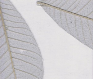
Another one of my little treasures is a translucent panel product, that has Magnolia leaves laminated between 2 layers of resin. That product put into a frame of 2” wide stainless steel made for a sensual yet modern alternative to frosted or clear glass. Clear glass might have been a bit of a safety concern, and frosted glass is always more cool in effect, so I appreciated it very much to have such a narrative product available to me. It was such a subtle, welcome addition to the whole product scheme.


A more tricky question was the selection of handles – as soon as you introduce several finishes on cabinetry one has to consider that they will need different hardware as well. The problem with that is that those different handles need to work together stylistically- details like the same type of metal finish or the shapes of corners and edges need to be looked at closely.
Due to it’s contemporary flavor and the stainless steel accents throughout I wanted to find a collection in stainless steel, and believe it or not – there is not all that much out there right now.
In addition to that I needed to find a recessed handle for the island ( I didn;t have a countertop overhang on the glass…), that was easy to grab – a lot of those recessed handles have either too small an opening, or are too harsh on the edges and therefore not nice to the touch. Or – if you have long fingernails – you end up scraping either the doors, or breaking your nails or damaging the lacquer all the time…
Anyway – we did find a line from a European manufacturer, that not only gave me the selection I needed, but also featured a handle just along our theme – one with a wave design! We used that one for the long perimeter wall cabinetry, and I managed to find a long handlebar for the tall appliances including the fridge, as well as a useful recessed pull for the island – yeay! Happy me…

For the powder room we obviously had the vinyl floor as a guidance, and then – along the way – both the client and I really liked a companion of the mango foil – in a light seagreen, which was thematically corresponding, and perfect for its water-themed location. We combined it with a light birch laminate for the tall cabinetry hiding washer and dryer, topped it with a delightful white cement based product with green glass in it ( the product line is called Icestone), and added mother-of-pearl finished glass tile mosaic for the backsplash.


You see – we were totally consistent with our beach theme! But it’s subtle and elegant, quite urbane if you wish.

The client was very delighted and commented on the fact that she has never experienced a contemporary environment that was at the same time so calm, tactile and visually rewarding.
