CARE Awards 2012
July 19, 2012
It already seems to be another really successful year for Ines Hanl and Kimberly Lewis Manning at THE SKY IS THE LIMIT DESIGN!
In February the interior design duo was awarded with 3 Gold Awards from the BC Chapter, and 2 Gold and 3 Silver Awards from the Canadian Chapter of the National Kitchen and Bath Association.
‘I am especially proud of the Canada-wide achievements’ says Principal Ines Hanl. ‘We are up against designers and architects from all over Canada, and the fact that we are able to hold our own against projects in metropolitan areas like Toronto and Vancouver speaks for the quality and ingenuity of our work.’
Hanl is also shortlisted in the annual ‘Designer of the Year’ competition by Western Living Magazine. ‘It’s already the second time that I receive this type of acknowledgment, within the short period of 2 years’, she smiles.
This year’s CARE Award competition saw the design studio enter 4 different projects in 8 categories – and all of them made it into the finals.
‘While this year’s projects are all on the modern side of design, the actual project briefs couldn’t have been more different from each other.’
Meanderings, which is a finalist in 4 categories, is the design studio’s first attempt to turn a builder’s spec home into a custom designed house. The clients, a young professional couple from Vancouver, wanted to switch gears from big city living, and move into a small up island community. They were intrigued by the idea of living on a smaller scale, with a focus on great design and high quality workmanship.
‘It was a fantastic project’ Hanl enthuses. ‘The clients let us refine the builder’s original house plans before construction started, and we were able to make adjustments to the layout, create a design theme, maximize the view, and focus on sight lines.’
‘The theme Meanderings refers to the image of waves and organic grow patterns, evoked by the vicinity of the forest and the ocean. It’s evident both in textures and materials, and in the sculptural design of the cabinetry.’
‘The clients were fantastic to work with – they got so inspired by the products we showed them, and we created a palette based on neutral shades, supported by bold graphic, strong colour blocking, and sensual surfaces.’
It’s a very modern interior, a unique combination of calm, serene and joyfully vibrant.’

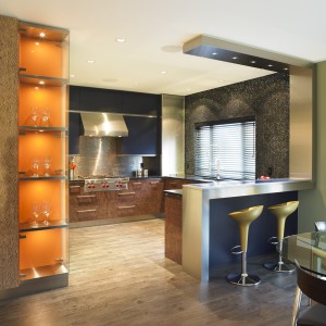
The second residential project is Shawnigan, a kitchen renovation in a lakefront home in Shawnigan Lake.
‘This was quite the brain teaser’, beams Hanl – ‘I really thrive on those kinds of challenges’.
The clients felt very drawn to a Tuscan style, with the lakefront facade featuring large scale arched windows. However, the inspirational pictures from their kitchen renovation ideabook sported Arts and Crafts design.
‘And then I came into the picture…’ laughs Hanl. ‘First it was easy – reorganizing the kitchen layout, changing the facade with the location of doors and windows, and continuing the arched window design.’
‘Even the perimeter layout of the kitchen was a no-brainer. But then we worked on island designs – and I showed the client how the shape of this island affected the rest of the room. I came up with 7 different versions for the island, and they started to fall in love with my most outrageous design. At one point I had to tell them that I wasn’t be able to give them a traditional Arts and Crafts look anymore, as it wasn’t in keeping with the design language of the island.’
Instead Hanl opted for a mix of charcoal and teak wood veneer, combined with a dark grey metallic finish and lots of stainless steel accents. The colour scheme was drawn from a iridescent turtoiseshell, black and charcoal glass tile blend, which was chosen because it brought the colours of the bark of the surrounding Arbutus tree inside.’
‘I paid further tribute to the client’s style preferences by selecting a floor tile in a stylized Arts and Crafts rose motif, which also picked up on the many curved shapes in the space.’
‘The unusual stainless steel post in the island was a necessary evil – I had to get power into the island, and because I wasn’t supposed to disturb the already in place heated floor I had to come through the ceiling. I designed the island with multiple heights to integrate this post in a natural manner.’
‘It’s a really sexy space now, with a gorgeous view, a serene flow, clean lines and beautiful details.’
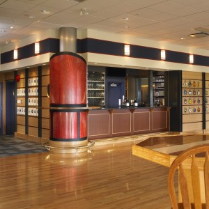
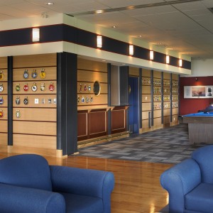
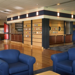
Behind the Venture project hides the Gunroom Bar for the Naval Education Center in Esquimalt.
‘This project was particularly dear to us’ states Hanl. ‘My coworker Kim’s husband was the Commander of the HMCS Vancouver, and all things connected to the base are very personal to Kim. We wanted to create a young interpretation of a marine themed bar, while still maintaining respect towards the long history and tradition of the Navy. I didn’t want to fall into the typical ‘West Coast’ design trap – all things big fir beams, lots of traditional wood paneling, huge slate fireplace etc…’
Instead, the design duo devised a modern take on tradition – with rift cut oak and quarter-sawn Mahagony paneling, rhythmically divided by charcoal steel supports which support the nautical flavour. A breathtaking, flaming red steel smokestack serves as an eye catching bartop, and provides traffic flow at the same time.
Marine accent lights, porthole windows, brass accents, coloured bands of navy blue and red, and a gleaming masculine interior for the bar make sure the students approve of their new hang out.
‘We cooperated with Ledcor Construction on the make-over of the bar, and I am very grateful for the fabulous and knowledgeable support they provided us with, to make our vision reality!’

The 4th project nominated for an award in the Best Commercial Interior category is ‘Eye Love You’, which is the competition name for the optometry store Fairfield Optical in the Fairfield Plaza. The store, which hadn’t had a makeover since its inception about 3 decades ago, was in dire need of a facelift.
Cooperating with Island Custom Cabinetry, the design studio gave the store a modern look appropriate to display the designer frames from Germany and France.
‘It was the first time we were working on an optometry store’ says Hanl. ‘This is part of what makes the interior design profession so exciting on the island – we get to explore all those different areas of retail, hospitality, offices.’
What’s next in store for the designer?
“We just finished a really exciting custom home in Kelowna. We also worked on a very whimsical Dr Seuss style playroom, and are often asked to design custom furniture like tables and beds. Another current pet project of mine is an Organic West Coast style residence up island, and we have been approached for a number of European and Mexican themed designs.’
‘We also get more requests which include architectural design, which is part of what I trained for at University in Germany.’ A custom designed Cape Cod style home is currently in the works in Comox.
‘ My past life in theater design, and my artistic inclinations really enable me to work in a wide spectrum of design styles. I traveled a lot throughout Europe, and spent some time in Mexico in the past years. I am also versed in historical architectural styles – for us, THE SKY IS THE LIMIT really is a life philosophy!’
‘If I could send out a wish I would really love to show what could be done with Spa environments, pharmacies, dentists and lawyers offices. In my opinion there is a lot of room for improvement in these categories here on the island.’
‘What I love right now, is to watch the development of a more unique definition of the ubiquitous West Coast Style’ enthuses Hanl.
‘Some of my local design colleagues and myself really try to stretch the interpretation of this style beyond the stereotypical use of dark wood, slate and fir…’
‘I am very grateful to all my clients who let me lead them a bit more along new avenues, as this does require a large amount of trust in my skills.’
Venture Naval Bar
June 10, 2012
About 3.5 years ago we were asked if we wanted to design an Entertainment unit for the Naval Education Center ‘Venture’ in Esquimalt.
Before
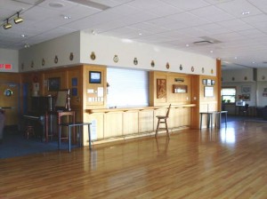
Not that we would have said no – but given that my colleague Kim’s husband was a Navy man, and Kim had lived all over the world following him in his pursuit, made this project so much closer to our hearts.
From that simple first step we got involved in the renovation of the bar itself – a process which took 3 years to complete, because it had to get approved by so many different levels of hierarchy. We actually never thought we would see the design realized – but it did happen after all!
The bar renovation was not big on the list of the person in charge of all the masses throughout Canada – but the Victoria crew ended up being victorious, and for the better. There were severe health violations in the existing set up, which needed to be urgently remedied.
One has to understand that the Bar is actually considered to be the living room for the students. They are not supposed to hang out in their rooms during their off times, but rather spend time with their peers to create a strong bond and companionship in preparation for their time on sea, and in potential peril.
The Bar is also a statement of pride in the naval history, and therefore required somewhat of a traditional approach to military symbolism. Using typical marine related finishes like oak, mahagony, brass, and adding the occassional porthole window along with the traditional colours of blue, white and red was mandatory in my eyes.
On top of that we wanted to bring the naval crests more to the attention of the visitors – those are small version ship crests, given as a keepsake to visiting crews, and quite often they are little pieces of art, or – if not all that well executed – they are at least real conversation starters! I was intriguged by them the moment I saw them for the first time – which was very high up on the existing bulkhead that runs around the large room, so that one could hardly recognise them.
I for one had a lot of fun trying to organize and position the 80 plus of them as one of my last tasks on site! It took about 5 hours, and involved not only the organization by size and a certain graphic component, as well as 2 naval officers, but also an insight into the relationship between the various ships ( or the lack thereof…)
Detail of the crests

Having said all that, I also wanted to give the students an environment that was more in touch with their own age – not the stereotypical West Coast look with some heavy oak paneling, slate floor, and a K2 stone facade thrown in somewhere.
Instead, we opted for a smokestack clad in a contemporary, fiery red metal ( note the detail shot – this pattern is actually inherent to the metal!), framed in black steel banding, and with an oak counter for a feature. The perimeter of the bar was clad in wide rift-cut oak veneer bands, which were accentuated with a Mahagony strip. Strategically positioned black steel U-channels give the whole length on both sides of the bar structure and rhythm, while adding a nautical flair.
The existing heavy bulkhead was adorned with some decorative marine lights, which were placed in the center of a navyblue band with red banding.
The feature smokestack

Detail of the smokestack
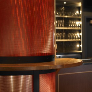
The inside of the bar needed a complete overhaul – indeed, most of the available (and rather tight) budget was spent on the remediation of the walk in cooler, and the restructuring of the bar itself.
We kept the existing fridges, and restored the beer taps, but everything else had to be new…

Due to the fact that the space is often divided into 2 areas, with the larger one being rented out for family events, weddings etc., the layout had to accommodate this fact with 2 barstations including beertaps and cashcounters.
There was one other aspect that made this project clearly unique – a government project required the services of a registered architect. We were fortunate to work with Al Hepburn from the Colbourne Architectural Group in Vancouver, who (after negotiating with me the use of the red metal for the smokestack, with which he had fallen in love when I showed it to him….) took our designs and created the necessary paperwork without any changes being made to our design intend.
Once the project was tendered we got involved on site again – maybe a bit more than was typical on those types of project, and not so much to the amusement of the very dear construction manager, who nevertheless pretty much accommodated my requests as much as he could. Thank you for putting up with me, John!!!
I have to say – I am definitely not used to get my choices of light fixtures and tiles changed to ‘whatever’ fits the tender budget, just because the suppliers did not think that I would be all that concerned about their replacement choices… What an odd world this kind of construction is!
Kim ended up laughing at me a number of times, saying things like: “THIS is how the real design world works -you give out drawings to a contractor, and then they do with them whatever they want….”
Yes, she had told me that a number of times throughout the years before, all the while with a sincere sense of surprise that our designs actually end up looking like our original drawings…. Now I learned what she meant with this!!
Go figure this didn’t sit all that well with me, and after some initial upset I ended up getting it pretty much my way. And I won’t tell the details that are not quite what I had envisioned – no need to spoil it for anyone else….
We are very happy with the result, and wish all visitors and students wonderful times of cameraderie in the space!
Fairfield Eyecare
June 10, 2012
Time flies….
Today we present you with the first of 2 commercial projects we were fortunate to be involved in throughout the last months.
The first was a retail space for Fairfield Eyecare, located in the Fairfield Mall in Victoria.
The store has been in business for about 30 years, and when the current owner took over 3 years ago he figured that it was high time to create an environment that was in keeping with the high end exclusive designer frames he was bringing in from Germany and France.
The store when we started

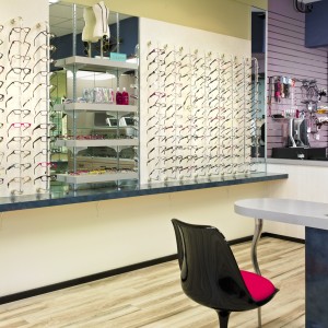
It was a real challenge to create a space concept for this rather small store – we had about 300 sq.ft. available for the merchandising area, the POS/ office and the workshop, with another 150 sq.ft. for the doctor’s examination room and back of house.
The second challenge was to create custom millwork for the high end products, as for security reasons those were supposed to be presented behind glass doors. The owner asked us to design custom units, rather then using readily available stock products from an outfitter for eyewear stores.
Never having worked on an eyewear store before we had to educate ourselves on the various ways for displaying and illuminating glasses.
View of the high end display wall

As for aesthetics: the client was looking for neutral, sleek, contemporary, with the incorporation of some colour in order to create a fun environment. I learned that a lot of business came through the door in form of teenagers who wanted to check out a pair of cool glasses, with the parents ending up purchasing something for themselves as well…
Given the fabulous pieces for sale it is no surprise, though – those designers from Paris turn each frame into a piece of art!!
View of the sunglass display case with the workshop behind– note that we arranged for storage cabinetry whereever possible!

A fun little fact – and it was not so much fun while we were at it – the previous tenant 3 decades before was a barber shop – and all the plumbing had been kept alive inside blocked off walls!! We ended up freezing the lines in order to install shut off valves, as due to the age of the mall there was no such thing as a water shut off for the individual store. We would have had to either bring the plumber in at midnight, or close the pub that was on the same plumbing circuit for the time we had to work on it!
We started out with the selection of finishes by looking at the right type of floor, and picked an unusual white-based faux wood floor made out of commercial grade vinyl, which is tough and easy to maintain.
From there we picked the various laminates for the cabinet fronts – mainly white faux wood ones from Italy, in both matte and glossy finish, a white leather-like wallpaper, paired those with a touch of bark-coloured faux wood and copper hued high gloss foil to introduce a masculine element, added some black and stainless accents, and threw in a few watercolour shades of blues, greens and lavender.
View of the open merchandising area
And a detail shot of the POS and office area – we told you it was a tight space!

Oh – right! We also added some royal blue for low counters, and the special ‘sneaky’ little cabinet at the dispensing table, which holds ‘add-on’ sale items in its top drawer. That’s it for you for sales-psychology…
Some curvy legs add the special something to the stylized eyeglass-shape of that dispensing unit.
The dispensing unit

It sounds so easy, right?!!
As usual it was all about sweating the details.
This is one of the aspects that makes the profession of design so similar to that of a dancer – no matter how much blood, sweat and tears heppen behind the scenes, the end result is suppossed to look easy and simply beautiful.
A little thing about Ines – in a humorous way…
February 25, 2012

I just finished writing up a biography for a casting call for the TV design show ‘LOVE IT OR LIST IT’…
It gives you a rather humourous insight into what Ines is all about.
German born Ines Hanl came to Victoria, BC in 2000.
Growing up in one of the most famous touristic hotspots of Bavaria, lovely and picturesque Rothenburg ob der Tauber, and being kind of an oddball throughout her teenage years made her destined to leave the country and make it big someplace else…
Her background includes an apprenticeship as seamstress, followed by 6 years of hard and low paid work in costume and set design for various theaters and opera houses throughout Germany.
After earning a Masters Degree in Interior Architecture from the University of Applied Science in Mainz, which taught her how to draw blueprints, but creatively really put the brakes on her (which was a good thing, by the way), a number of internships with architectural firms followed. Next came learning the ropes as a junior designer in a small design studio, and a stint in a high end furniture store in the Bavarian outback.
Together with her partner Klaus Kinast, who himself had a colourful career designing theme parks and animated 3dimensional attractions, she was also very hands-on involved in the creation of whimsical and phantasic theme store environments.
Working in carpentry shops (especially on the beltsander…) and swinging various sizes of paint brushes to achieve decorative paint finishes prepared her brillantly for the unique work environment of construction. She has never worn jeans ever since that time, though.
Hanl cites that her strongest influences are the Renaissance, the Bauhaus, and Cirque de Soleil – along with a little bit of Dr Seuss, who was unknown to her until she came to Canada 12 years ago (seriously).
When Hanl was finally able to land a job in the kitchen and bath industry in a town that was back in those years run by 2 well situated interior designers, she was determined to blow the townfolks’ mind – but not until learning about the local ways of building houses, which was indeed a little bit different than where she is from.
Anyways, after 4 years of learning the ins and outs of custom cabinetry – foremost taught by a Swiss Master Cabinetmaker (with whom she speaks English, by the way, because she wouldn’t understand his heavy German accent) she decided that she had to go after bigger fish – after all, why would she have spent more than 4 years at university if she couldn’t put it all to good use.
She started her own studio, THE SKY IS THE LIMIT DESIGN -not realizing that some people would totally misunderstand that name and only think of all that money (their own, that is) flying out the window…
Little do they know that it is all about creativity, and endless possibilities…
Since 2005 Hanl has been garnering local, provinicial, national and international awards for all types of renovation projects, new construction and retail space design – all in all about 26 trophies grace her shelves at the moment. Numerous magazines throughout North America have featured her work, and journalists love working with her as she always has colourful stories and thoughtful insights into her work to share.
Maybe it is just her accent, though…
Her range of style is broad – no limits there either. She is very apt in bringing the best out in Victorian (the decade, not the location) or Arts and Crafts period houses, and she is familiar with European design styles throughout the ages, but in the past 3 years she has begun to develop a style that is unique to herself.
Let’s call it sensual contemporary West Coast… unless someone comes up with a better expression.
Playful, colourful, tactile, sculptural, occassionally very bold, and always full of surprises – yet with calm spatial undernotes that make a home oh so comfortable. Great lighting on top of that, and grounded by a serious philosophic underbody which she is able to explain in a logical manner. Especially men like the fact that she is not just touchy feely about her work…
Did we mention that Marital couselling is part of her job description? She has proven her abilities to surprise at-odds partners with solutions that are totally different from what both of them expected, yet incorporate what was important to each of them.
Hanl is all about teamwork. Her clients, no matter how little creative they themselves think they are, are being coaxed into collaboration – and to their own surprise they love it! That, plus the homework Hanl always gives them…
Hanl loves to empower clients to take charge and express themselves in their home.
Creating multiple options for space concepts before blending the variations into a final version is followed by looking at (often unusual) products and finishes. Hanl expects cooperation and a can-do and wanna-do attitude from her team, and while she always asks for technical input from the specialists it will be her having the final say when it comes to design – but always in a nice way, unless the trade is an idiot.
Hanl can’t promise that she is as attractive in real live as the picture above pretends – most likely rather not.
But if her English turns out to be understandable, and if she doesn’t freeze up in front of a camera (because she is typically more of a behind-the-scences kind of girl) this design goddess would love to get a shot at being on TV.
BTW – there is more to Hanl’s world than just design – she actually wiggles her goodies to Bellydance Fusion music, expresses her Bohemian Gypsy genes through Flamenco, is known for her outrageous selfmade Fascinators, her 5 (formerly stray) cats who don’t let her sleep at night, her love of gardening, and the fact that she, although a genius with kitchen design, chooses to not really swing a spoon in her own kitchen. Although she makes great cakes, that is.
And she really doesn’t like Alcohol, as she would get drunk from a single snaps praline.
HOUZZ.com
January 23, 2012
Recently we joined the Houzz community, and quickly became quite involved in it. Members can download inspirational photos from all over the world, find products and also ask questions to other members and designers. We created 2 ideabooks already – make sure to click on the link below, and once you are there, click on the ‘article’ icon on the very right top to make sure you can read up on the Ins and Outs on Countertops!
Happy New Year – A January Update
January 18, 2012
Can it really have been 5 months since our last entry???? Gees….
First of all – A VERY HAPPY NEW YEAR to all of you! May it be filled with positive experiences, inspiration, love – all the good stuff….
Time flies, and we have been busy, so this is just a quick summary of what has happened since September.
Fairfield Eye Care Center
This was a TV worthy 10 day renovation ( stay realistic and keep in mind that we typically don’t pay double and tripple shift TV crews to work all day and all night!) of a 1970′s eyewear store which, in a previous life, turned out to have been a barber shop ( I found out the hard way – there were a number of still life waterpipes buried in the wall, and NO water shut off!).
We made it happen, and it is now a fashionable, elegant yet cheerful environment worthy to showcase the one-of-a-kind collection of German and Parisian eye-’candy’!
The store comes with an optometrist office as well as it’s own workshop, and owners Sang and Meki along with the fabulous Lisa will be happy to outfit you with a stunning pair of glasses.

Venture Navy Education Center, Esquimalt – The Gunroom BarWell, well, well – our first endeavour of working for the government. 3 years in the making, we are finally seeing a nautically themed bar almost completed (another week or two to go – yeay!). Of course we approached the task of designing the space a bit different – none of this “dark wood, slate and large split rock fireplace” kind of thing, that seems to be so ubiquous everywhere I go. (A hint for bar, restaurant and hotel owners – PLEASE, do yourself and your customers a favour and hire US!! Going out in Victoria could be so much more interesting!!)
My dearest partner in crime – Kim – has a very personal relationship to the navy (having been a military wife for 15 odd years and such), and I have the suspicion that for the first time in the 4 1/2 years that she has been with THE SKY IS THE LIMIT she was a bit doubtful if I, a total landmouse, could pull it off and do this prestigious military establishment visual justice.
We will take photos, so that you can judge for yourself, but I can say that I myself are already thrilled to bits with how it came together!
It feels a bit like being on a ship (go figure), with riftcut oak, mahagony, some brass, porthole windows, lots of blackened steel, and a flamming red and illuminated smokestack!

The condo reno from hell
Every designer and contractor will have at least one of those in their life- and I think that is all right, as we can all learn from this experience. However, the lovely clients who endure this ordeal with a composed grace that I will be eternally grateful for, really do not deserve this!
Everything that could possibly go wrong, did – and still does. That’s totally unfortunate, I for one am heart broken over that, but it will make a very good story at a later point. It will be one of those picturebook accounts of what to expect when renovating, which is always amusing when one is only listening to it.
Just to say that much – no matter how fantastic a crew one has, and never mind how organised and well prepared one is – life has a way of keeping you humble…
Nanoose Bay
Now, that is a great project which kept the creative juices flowing those past months. It started innocently enough, with a client from Calgary asking if I wanted to have a look at their home up island.
It turned out to be a rather large make over and a fantastic challenge to create a true West Coast home with flowing shapes, lots of texture and playing with finishes in a rather artistic manner.
Construction is now well underway, and we will report on the outcome later in the summer.

Kelowna
That one is pretty much done, and I am waiting for furniture to come in so that we can do a 2 day photoshoot. This is also a very exciting showcase of the way I really like to approach design – despite the huge scale the kitchen feels like the cabinetry is dancing in the space, and the mix of materials and colours throughout the house is a joy to see and touch.

Comox
The ‘spec-house-in-new-neighbourhood-turned-custom-residence’ will make another great story.
It’s a great example of how one can turn one of those non-descript builder homes ( in my native tongue I would call this a 08/15 house, but that’s a different story) into a piece of applied art.
Very modern, it is very different from all the other before mentioned interiors, and I can’t wait to get some good pictures…
Again, we are waiting for furniture – the Bombo bar chairs we ordered came in from Italy – but in the wrong colour – so we have to wait yet another 2 months. The sofa from France should be here anytime soon now, though!

What else…
And Martin Zemp from Zee Design is finishing off this magical kids playroom, that all of us grown ups really want to hang out in….I have been told that the 2 lucky girls insist on getting dressed in front of that princess mirror ( which is in fact a mirror laminate which can’t break) every day!

We were busy between Christmas and New Year – that ONE week a year that people in the construction business can usually take off …
I assisted Jo Ann Richards from Works Photography who was in charge of taking about 20 (!!!!) pictures each of 2 of our projects for a book on kitchen design. 20! – on a ‘normal’ photoshoot day we might get 10 or so….But we had a tight deadline and needed to get it done…
But then again – our work in a book!! yeay!
I also got Jo Ann to take new pictures of my face…

And then we were asked to do the architectural design for a new custom residence in a kind of New England style, and that had to happen in that week as well.
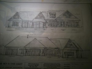
Other than that we have a bunch of renovations to plan,and it looks like it’s going to be a busy year.
We will do some lectures and seminars at this year’s CHBA Home Show as well, which is in April.
Watch out for schedules and press releases for this event!
That’s it for this time – I hope to be able to spend some time writing in the near future!
Food for Thought
September 25, 2011
Psychology Today on ‘How the American Dream undermines us’ – April 2011
Spending a quiet Sunday on the couch today with a bunch of magazines, I came across the above mentioned article, and I thought an excerpt would be quite suitable for my blog, as it relates to our work.
I am quoting Andres Duany, coauthor of ‘Suburban Nation: The Rise of the Sprawl and the Decline of the American Dream’, from an article written by Lauren Sandler
‘Today’s houses are’ fully equipped to compensate and mitigate the loss of the public realm’, Duany says. Fifty years ago homes averaged 1,700 square feet. Now that figure is up to 2,700, and interior architecture, in Duany’s mind, exists to mimic an urban world where few Americans dwell today. The double-height entry hall is the surrogate of the town square, the media room supplants the theater, the master suite practically exists as its own townhouse. Multiple dining areas further service our separation from the outside world: The breakfast nook is the diner, the formal dining room is the special-occasion white-tablecloth restaurant, even the kitchen island functions like a European tabac. ‘If you had a public realm’, Duany says, ‘you wouldn’t have to buy more house.’
Your thoughts??
Shawnigan Lake – Client Feedback
September 12, 2011
Today’s blog has been made easy for me ( I really like getting submissions from my ‘partners in crime’ - as much as I enjoy it, but not being ’forced’ to spend long hours scanning and wordsmithing once in a while is very convenient – yeay…) – a big THANK YOU to very wonderful clients for their beautiful letter to us!
I thought it might be great idea to share their sentiments, as they were total newcomers to working with a designer – and of course we are proud to share their praise with our readers….
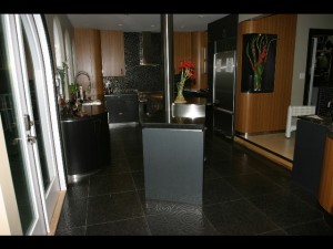
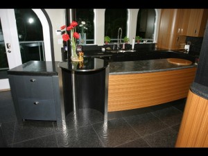
The project will get photographed professionally soon, however, at this point I can only add snapshots. In my mind this project was always the sexy, dark and handsome sibling of our very calm and sensual Kitsilano job…

Hi, Ines,
When Naz and I first decided to reno our kitchen we called my cabinet maker friend. He came over with his designer and we chatted for a while. I guess you know that originally I had intended for a more traditional Greene and Greene style hardwood kitchen. The conversation we had with them was brief and the designer didn’t actually speak.
After they left Naz and I had a conversation about how it had gone with them. We realized that all we were going to end up with was our same kitchen with new boxes.
We’ve done a lot of renovations since we bought this house in 1993. Each one was done as we could afford it and in a rather haphazard fashion. We didn’t really have a long-term plan as we were never sure how each room was going to be used. In the first few years we lived here we moved our furniture around so much from room to room that we should have put wheels on it. The office space was in 3 different spots, the master bedroom in 2, we had a dining room then no dining room, the pinball machines were downstairs then upstairs, we had a piano then no piano and so on. We went from the original carpet in the kitchen to lino to tile and from carpet throughout the house to hardwood and cork and even some laminate.
Anyways, as we realized that we were heading for new boxes in the kitchen we decided that perhaps it was time to do something with more of a plan – something to tie it all together. That’s when we went googling and looking at portfolios and found you.
When you first came up we didn’t know what to expect. We’d never worked with a designer and, frankly, we used to laugh at people who did. We’d always done our own thing and – for the most part – it always turned out to our satisfaction. The first thing you did when you came in was admire the view out the window and point out that the spindle handrail made it look a bit like a jail. We’d been looking at it so long we never really thought about it anymore. But when you pointed that out we realized that you were right. You walked around for a while listening and swapping ideas and, despite the fact that you had only agreed to come up for a couple of hours you were here for closer to 3 1/2. You weren’t watching the clock and you seemed genuinely interested. After you left Naz and I talked about our meeting and we were both very impressed with you.
Since then we’ve not been disappointed. You’ve got a special gift for visualizing spaces and materials. You’ve also got an obvious passion for what you do. It’s not often you meet someone who is both good at what they do and obviously loves to do it but you are one of those people. At every step you’ve taken whatever time and measures it took to make sure that each and every detail was correct – there were no surprises – no ‘gotcha’s. Where one material ended you made sure that it transitioned into the next appropriately both in size, space, and material. You communicated with Bert and Jivko behind the scenes to ensure that everything went according to plan and you communicated with us to make sure that we got what we wanted.
(…)
Anyhow, the purpose of this email is to thank you for all your hard work. Naz and I are very happy with the way things turned out. The whole ground floor is now one continuous area that we’re proud of. Honestly when we look in the kitchen from above it’s hard to believe it’s ours – it looks like something out of a magazine. I don’t think there’s any designer that could have done a better job with this space.
Thanks, Ines!
Mark and Naz
